Client Background:
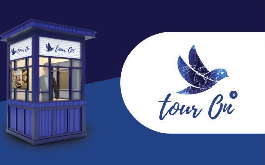
tourOn, a distinguished company in destination management, approached us with a clear objective: a comprehensive brand restyling. They required a fresh, modern look to better resonate with their audience without changing their identity.
Challenges:
Kiosk Optimization: Effectively utilising the space of a kiosk, printing, and displaying it required careful planning and design considerations.
Ensuring Consistency Across Diverse Channels: Maintaining a uniform brand identity and messaging across various channels, including digital, print, and social media, was challenging.
Results:
- Strong Audience Resonance: tourOn’s new brand identity strongly resonated with its target audience, reflecting a fresh, dynamic approach to destination management.
- Uniform Brand Representation: The new brand was consistently applied across all touchpoints, both online and offline, ensuring a cohesive brand experience.
- Enhanced Market Presence: Kiosk Design (under Zcapy brand) The new brand was consistently applied across all touchpoints, both online and offline, ensuring a cohesive brand experience.
Conclusion:
Today tourOn’s new brand identity resonated strongly with its target audience, conveying a fresh, dynamic approach and tourOn’s brand message remained uniform across all touchpoints. The complete restyling of tourOn’s brand, along with the innovative kiosk under our brand Zcapy, exemplifies the transformative power of strategic rebranding and creative design. By infusing modernity and a dynamic visual identity, tourOn has not only revitalised its brand but also elevated its presence in the competitive destination management industry.

